Cover and feature spread illustration about the future of robots and their role in society.
Facebook updated their branding guidelines, including rules for illustration. Images were to look hand-painted and scenes had to be natural compositions with people having realistic proportions.
This series for Facebook Pay branding highlights key ideas for electronic payments.
I love the dramatic action in this scene. It was commissioned for a lenticular poster the OL would use all over Oregon.
We came up with this style based on some inspiration the client sent and put our spin on it. It’s very much an organic, India ink, graphic style in monochrome with a paper texture that ended up being used in animation.
International Hotels Group wanted comic-book-style illustration their animated video. It was so much fun to get that look together with such a punchy color palette.
This illustration was created for an ad featuring Mitsubishi’s electric car that could go the extra mile. There are so many fun details in this scene filled with every bad possible character and situation.
There’s an old bomb in the roof, a ghost, an axe in a stump, the Grim Reaper—too many things to list.
The Facebook Portal team wanted to create an original children’s book for their Story Time app, and they wanted a child-like oil pastel outline and paper cutout look.
Ingram needed some 3D illustrations of hardware, but needed it in vector format so it could scale to any size. So, we illustrated these in Adobe Illustrator using the perspective grid to assist in the process.
We landed on a graphic ink and flat-color style for this series that conveyed a journey of exploration. It was fun to incorporate some epic landscapes, yet keep the details simple.
Warner Bros. hired us to create artwork for Christmas Vacation that could be licensed for products and packaging. We had to dance around the fact that none of the actors’ likenesses could be included, so we ended up silhouetting their faces and using compositions that didn’t focus on their facial expressions.
There’s a lot of fun pieces here that are still seen on merchandise every Christmas season.
Sometimes you need to follow the illustration and icon style guidelines for huge brands. When you do, it has to look just right.
Warner Bros. needed fresh illustration to license for the 50th anniversary of The Wizard of Oz, so they commissioned several landscapes that could be used for product packaging and promotional materials.
AltSource needed to define illustration that worked with their existing brand, so we came up with this fun, isometric style that has a reduced color palette. Some of the fun details include big pixelated elements and detailed line and icon overlays.
We defined an updated icon set that worked with this legacy organization’s existing brand. It’s airy and modern with an accessible feel that emotes friendliness.
Popular Science commissioned these spot illustrations for an article on environmental issues. The trick was they wanted them to look like merit badges, so we included the the stitching and fabric texture.
Facebook had an illustration style already set, so we matched it and created several new concepts unique to Facebook Pay.
Popular Science hired us to illustrate this feature story on the health dangers of being severely overweight. This got an honorable mention in CA’s Illustration Annual.
The University of California Irvine has a magazine and hired us to do cover illustrations for two consecutive issues about the future.
We needed a technical, yet flat graphic style for an animated video for GE, so we used a modern, saturated color palette, with flat colors applied to realistic objects. As a complement to the graphic fills, we added objects made of pure linework to add that technical feel.
BP needed character illustrations in greyscale for an animated video that showcased company roles all over the world. These faces are whimsical, diverse, and distinct characters from one another.
The Library wanted to create a poster that could appeal to kids, so we created a fun, 2-color graphic style that was dynamic and full of adventure.
Warner Bros. commissioned us to create two versions of the infamous leg lamp from A Christmas Story. The first style was to be graphic and fun, while the second would be a realistic airbrushed style. The art is used in merchandise and packaging to this day.
A boutique, high-end recording studio right here in Portland, OR wanted a signature piece of artwork for promotional materials, so we offered a few style variations they could choose from.
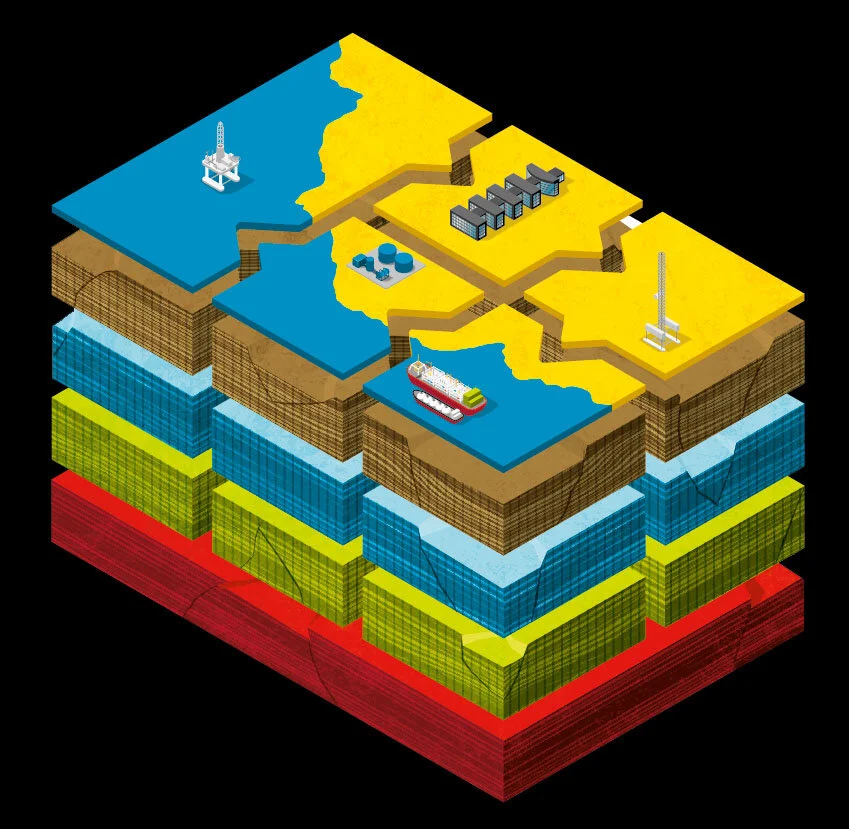
Apparently, there are many layers to the earth, and Shell needed to explain what happens at each level. We went with an isometric view that showcased a bit of the strata and texture.
This flat, sepia tone, textured style was on the cover of Sustainable Industries magazine where the issue focused on the future of metro ecosystems.
These traveler characters were created to look like graphic black and white ink drawings that would appear huge on the walls of IHG’s trade show booth.
Popular Science Magazine commissioned this feature illustration for an article on the death of the virus, Rinderpest. What better than to show all the other viruses attending the funeral?
This patchwork of several scenes, textures, and patterns was commissioned for the cover of The Deal Magazine for a feature on the carnival atmosphere of business.
The rough, loose textures, subtle words and lettering, and character styles really add to the fantastical nature of the carnival.
It takes an army of artists to sustain the representation of Disney characters in the marketplace. We created these samples to market ourselves to the Mouse and ended up getting hired to do other things instead.
This cover artwork was commissioned for the European edition of the Wall Street Journal Magazine which featured a story on Euro-Football and who controls the teams and players.
This whimsical scene of frogs joyfully playing music was commissioned for California’s Prosper Magazine. The watercolor look sets the wetland scene effectively.
The Facebook Portal team wanted to create an original children’s book for their Story Time app, and they wanted a kid-like paper cutout look.
The Scene hired us to illustrate their magazine cover highlighting a story about a local politician who was less than empathetic.
All Hands Raised needed illustrations for their new booklet that showcased their purpose in the community. This illustration style has dark lines with misregistered colors underneath, feeling a bit like graphic watercolor, and it conveys a warm earnestness.
Robots became popular subject matter for us. This one was created for an elementary school textbook discussing the future of intelligent robots.
Sometimes children’s style illustration is the right solution. In this case, Ingram Micro was doing a story on technical support for one of their publications, and the silliness here was just the right thing.
There’s something about devious gremlins that are always causing trouble. This was commissioned for a story on electronic banking continually under bombardment by hackers.
This robot was commissioned for a calendar series for an AV electronics company. The action and drama are high in this one!
Isometric illustration is common for laying out cities and neighborhoods. Bentley wanted to showcase the issue of infrastructure and development, so we created this very detailed map.
Facebook hired us to explore illustration styles for an original children’s book on their Story Time app. They wanted it to be kid-friendly, some hand-done elements, and a bit of layering.
Popular Science hired us to do this feature illustration for a story about bringing your Android Tablet back to life.
Seattle Magazine hired us to create a spot illustration for a story on how Starbucks was getting so huge that they may have to open their own theme park.